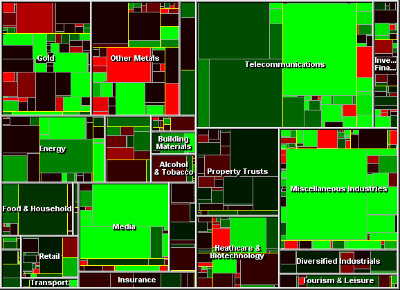
WebLink's Market Map service gives an innovative view of the market as a whole. Each small rectangle is a company. Colour represents movement, and size represents volume. By moving the mouse over the Market Map, you can collect information about each company.
The Market Map has two strengths. First, you can guage at a glance the mood of the market. The image below was taken on a positive day, with heavy trading in telecommunications. Secondly, it allows you to instantly spot unusual behavior, such as the 14% fall in Crest (the red rectangle in Other Metals).
Try it now. Move your mouse over the map.
|
